Project duration: two weeks
Project Type: Hypothetical
Tools: Figma, Google Slides, Lucidchart, Mural
(And the classics: pen, marker, paper, cerebellum, etc.)
Methods: User interviews, comparative analysis, user testing, cart sorting, design studio
Team: Thatcher Snyder, Jacqueline Ma, Vincent Alojado,
Mariana Gomez
Client: Artists’ Television Access
Illustrations: credited to Pablo Stanley
ARTISTS’ TELEVISION ACCESS
Artists’ Television Access is a San Francisco based community arts organization established in 1984 to showcase various modes of abstract and figurative fine art. But in the 36 years since ATA’s founding, San Francisco has transformed from a city of art and radical politics into the locus of tech-based capital, the hurricane eye of our information economy. Though ATA’s mission has not changed, the city has. The world has. ATA needed a way to foster their community, to exhibit innovative art, and provide a platform for non-conformist ideas in this new San Francisco—a forbidding place for budding artists.

Project Goals
To provide ATA’s patrons with direct access to showcased work.
To create a submissions system that encourages artists to submit.
Research
Our redesign begin with an evaluation of the current ATA site, where we found two obstacles to our project goals.

No Gallery
The ATA site did not showcase artwork in a visually appealing way. Work appeared exclusively on the ATA blog—stuck in with event listings, community call outs, and gallery adverts.

No Submissions
Links for artists who wished to submit to ATA were difficult to find. The most visible would take artists off the ATA site. The others were hidden within discrete blocks of text on the Exhibit page.
Comparative Analysis


After identifying these obstacles, we surveyed other sites to identify how they showcased their artwork. The sites of both SFMOMA and the de Young Museum were more visually engaging than the ATA site, in part because they made their artwork the primary visual element. Compared to ATA, both museums used far less text, and far more images.
We also examined other community galleries. Almost all—the Jonathan Ferrera Gallery, Paragon, Ground Floor, etc.—had a clearly labelled submission call on their homepage.
Interviews

After checking out other sites, we interviewed a group of artists, who educated us about the individual emotional and psychological aspects of the submissions process. From these interviews we were able to identify specific pain points for the artists who would potentially submit work to ATA.
One major problem in submissions was the feeling, shared across all our interviewees, that they were all competing to place work. And that the submissions process operated as a referendum on the quality of their art.
HYPOTHESIS
As a community arts space, ATA wants to encourage people to engage in their community, and in the artistic community more broadly. ATA does not, however, want to encourage the noxious sense of arrogance and insecurity that can be a byproduct of the submissions process.
We proposed a redesign of the submissions process that would encourage, rather than discourage, artists to engage with ATA, and with their broader artistic community.
Design Studio
It all begins with an idea, but the road from ideation to actuality is fraught. Missteps—crystal Pepsi, hair crimps, pets.com—are inevitable. The paperclip below was my team’s attempt at an avatar, or mascot, that would accompany artists through ATA’s submissions process. Given ATA’s fractious relationship with the tech industry, my team thought that an ironic appropriation of Windows 98’s Clippy would strike the right note: interesting and funny, yet warm and approachable. Clippy would operate as artists’ guide through the submissions process.

But creating an animated, anthropomorphic paperclip was—surprise!—difficult. We didn’t have the time to write Clippy’s dialogue, nor design its many actions. Tonally, also, Clippy was a gamble. Though we hypothesized a quasi-punk appropriation of Microsoft’s intellectual property would be appreciated by ATA’s patrons, we did not have the time to test, nor validate, this assumption. Given our design constraints, we decided, however unhappily, to relegate Clippy to the proverbial shelf… an idea for another time. We then decided to focus in on the mechanics of ATA’s submissions flow.
Submissions
The problem: ATA had no submissions flow. Though ATA solicited and received submissions, it did so only through email—email that was not directly linked to ATA, email that was routed through personal accounts, through curators and friends. The institution itself had no direct submissions process. So we had to build our process from scratch. Thankfully, the internet is replete with submissions processes, from which we took influence and crafted a flow that inspired trust, created a space for individual validation, and provided a welcome touch of human warmth.
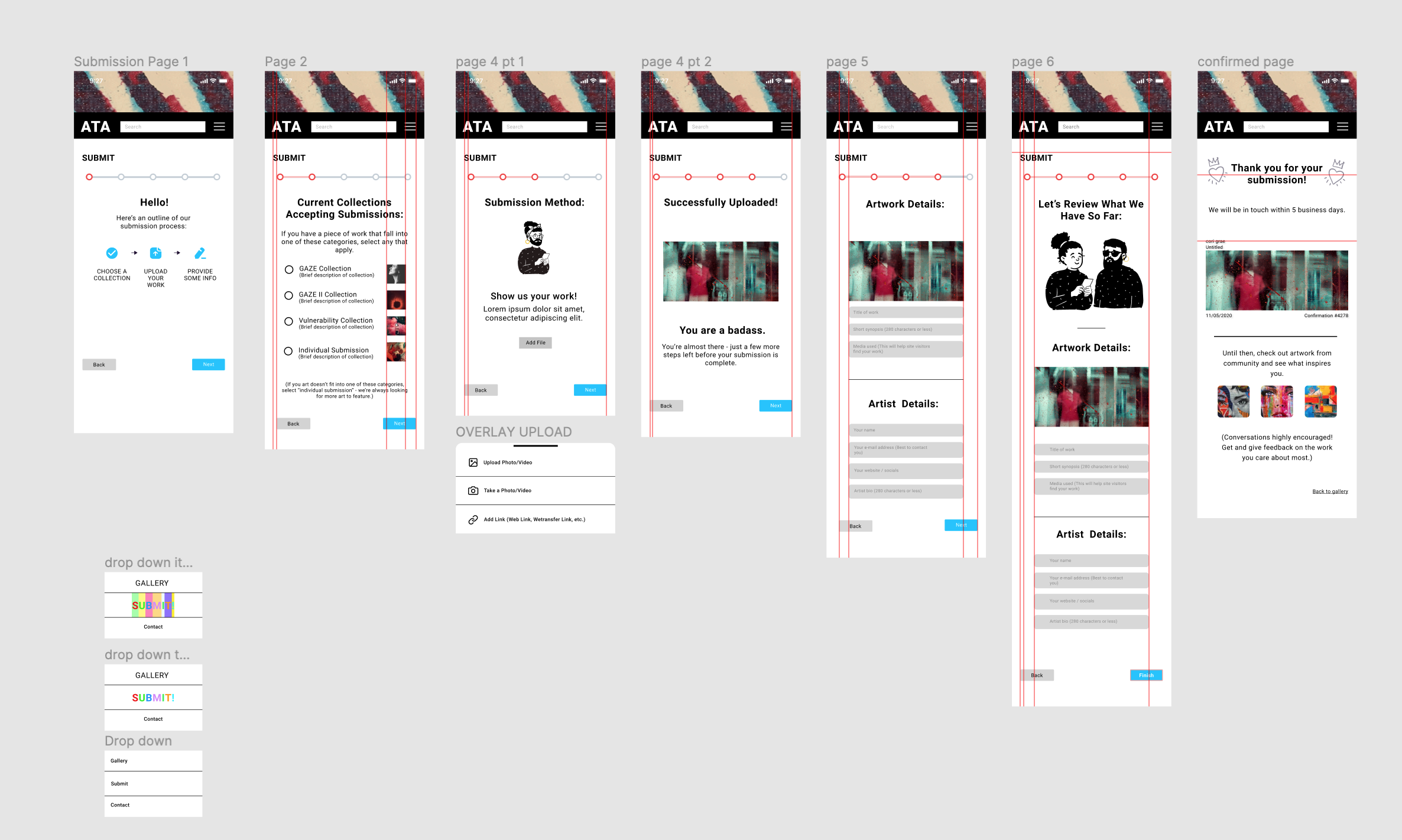

Navigation
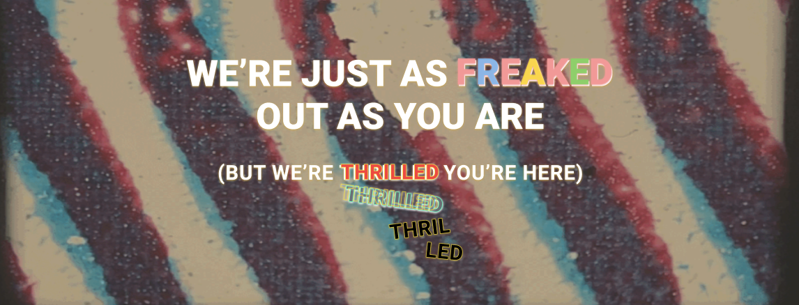
The first frame in our flow provided artists with a description—visual and verbal—of ATA’s submissions process. The first word, a friendly ‘Hello!’, coupled with the steps to be completed, creates a feeling of security, of safety for submitters. We have charted out the deep water for them. They know now: there are no dragons here.

Validation
The personal, and highly emotional, nature of artistic creation demands an emotionally engaging submissions process. Along with our friendly ‘Hello!’, we provided multiple other messages of validation, as well as modes of peer-based address (‘homie,’ ‘pal,’ etc.), which were intended to set the submitting artists at ease. We did not want these artists to feel judged by the process. We wanted them to feel encouraged, and accepted.

Illustrations
We also added a number of illustrations to the homepage and the submissions process. This provided the artists with a human avatar, so that they did not feel alone navigating through the submissions flow.
Conclusion
The current design of the ATA website is at odds with its values and message. The site is unfriendly, cold, a bit standoffish. In order to encourage submissions, we designed a warmer, more empathetic site that accords with ATA’s values. Our approach was centered around ATA’s patrons, specifically those who love art enough to create it, show it to others, and risk criticism that could cut them down. We used our interviews with artists to guide our design. By focusing on the emotional component of artistic submission, we were able to create a new submissions process for ATA that embodied the values of their artistic community: openness, warmth, and enthusiasm for artistic risk and intimate emotional disclosure.